
IDE overview#
This chapter describes the layout of the GUI Guider integrated development environment (IDE), the purpose of each work area, and the typical operations available in each one.
GUI Guider is organized into three top-level areas, presented in the order a user typically encounters them:
Home page: The launch area of the IDE, shown when GUI Guider starts. Use it to reopen recent projects, create new projects from a hardware board or an application template, import existing projects, configure IDE preferences, and view product messages. The Home page includes the Create project, Board templates, Application templates, IDE setting, and Message center sub-pages.
Workspace page: The main development environment, opened once a project is loaded. The Workspace page integrates screen editing, widget configuration, resource management, event and variable definition, code browsing, preview, build output, and serial communication into a single layout. Its panels fall into four groups:
Editing and navigation: UI editor, Widget tree, Layers, Code editor, Preview center.
Asset and configuration: Widgets usage, Resource manager, Properties, Styles.
Logic and interaction: Events, Global variables.
Runtime and diagnostics: Log, Serial port, Project info.
Shortcut keys: A reference list of keyboard shortcuts for project management, editing, build and run actions, simulator and target pipelines, and canvas navigation.
Home page#
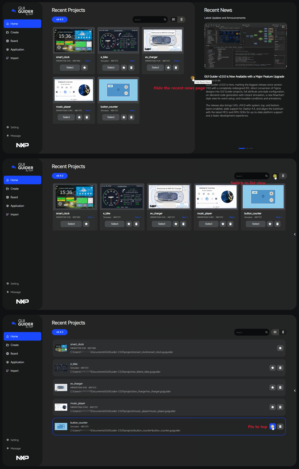
The Home page is the entry point of GUI Guider. It provides access to project creation, project import, recent projects, hardware and application selection, IDE setting, and product messages.
From the Home page, you can reopen recent projects, create a new project, or import an existing one. When no recent projects are available, the page directs you to project creation or import.
A Recent News section displays product announcements and version updates. It can be hidden to expand the visible project list, and shown again when needed.
The Recent Projects area supports two display modes: a card-style layout for visual browsing and a list-style layout for dense scanning. Projects can be marked with a star to pin them at the top of the list for quick access.
Create project#
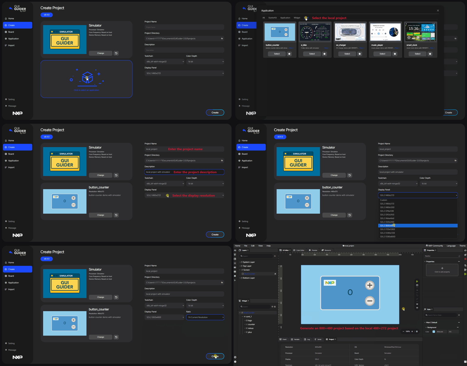
The Create page starts project creation from an official application template or from an existing local project.
Each official application template is designed for a specific resolution, which is preselected as the default resolution during project creation. If you want to use the template at a different resolution, select the target resolution explicitly. When the selected resolution differs from the template’s original resolution, a Ratio option appears with two choices:
Original: Keeps the template at its original design size.
Auto-scale: Adapts the template content to the selected target resolution.
A project can also be created based on an existing local project used as the template. The same resolution and Ratio behavior applies: the local project’s resolution is used as the default, and the Ratio option appears when a different target resolution is selected.
Note: Auto-scaling does not always produce an optimal layout. Minor manual adjustments to the design may be required after the project is created.
Board templates#
The Board page starts project creation from the hardware side. Boards are organized by target type, covering simulator, MCU, and MPU platforms supported by GUI Guider.
Click More on a board entry to view its detailed specifications, such as core, operating system, frequency, SDK version, memory, default resolution, and a short description. Boards can be marked with a star to pin them at the top of the list for quick access.
Application templates#
The Application page starts project creation from the application or template side, covering starter kits, full applications, individual widgets, and local templates.
Click More on an application entry to view a short description of what the application demonstrates. Applications can be marked with a star to pin them at the top of the list for quick access.
Board and Application provide two directions into the same creation workflow: select a board to filter applications, or select an application to filter compatible boards.
IDE setting#
The IDE setting page manages the local GUI Guider environment.
Setting |
Type |
Description |
|---|---|---|
Theme |
Select |
IDE theme. Options: Light, Dark, Blue. |
Language |
Select |
Display language. Options: English, 中文. |
Export Path |
Path |
Default export path for generated output. |
MCU Toolchain Path |
Path |
Toolchain |
MPU Yocto Toolchain |
Text |
Toolchain |
Generate Code Prompt |
Checkbox |
Whether the code-generation prompt is shown in the IDE workflow. |
Offline Template Mode |
Checkbox |
Enables offline template mode, in which GUI Guider loads templates from a local package instead of the cloud API. |
Offline Template Path |
Path |
Root path of the extracted offline template package. The package must contain |
Changes take effect when the mouse leaves the field.
Message center#
The Message center lists all official messages published for the current GUI Guider version. The Home page shows only the five most recently published messages as a quick summary; the full message history is available in the Message center.
Workspace page#
The Workspace page is the central area for daily development. It is where you edit screens, configure widgets, manage resources, work with events and variables, and review project content.
Toolbar#
The toolbar provides direct access to frequently used editing and run-related actions.
The toolbar items are generated from the workspace action bar. The main actions include:
Run JS Simulator: Starts the JS simulator directly from the toolbar.
JSON Editor: Opens the JSON editor or code-preview workflow from the toolbar.
Align Left: Aligns selected objects to the left. Available only when at least two widgets are selected.
Align Right: Aligns selected objects to the right. Available only when at least two widgets are selected.
Align Top: Aligns selected objects to the top. Available only when at least two widgets are selected.
Align Bottom: Aligns selected objects to the bottom. Available only when at least two widgets are selected.
Align Center: Aligns selected objects horizontally to the center. Available only when at least two widgets are selected.
Align Middle: Aligns selected objects vertically to the middle. Available only when at least two widgets are selected.
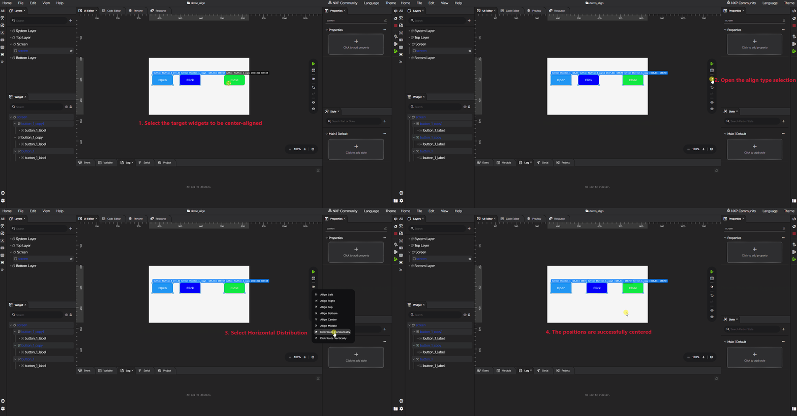
Horizontal Distribution: Distributes selected widgets evenly in the horizontal direction. Available only when at least three widgets are selected.
Vertical Distribution: Distributes selected widgets evenly in the vertical direction. Available only when at least three widgets are selected.
Undo: Reverts the latest editing action.
Redo: Re-applies the latest reverted action.
Move Up: Moves the selected widget one level up in the current hierarchy.
Move Down: Moves the selected widget one level down in the current hierarchy.
These actions reduce repetitive menu navigation and speed up common workspace operations. The following example shows a simple widget alignment workflow that demonstrates how to use horizontal center alignment.
LVGL setting#
The LVGL setting dialog edits the project’s lv_conf.h values that the generated code uses to configure LVGL. It is organized into up to four tabs: Common, Simulator, Target, and Advanced. The Target tab is hidden when the board type is Simulator, MCX, or RW.
Common#
The Common tab covers settings that apply to every project.
Setting |
Description |
|---|---|
|
LVGL refresh period in milliseconds. Range: 1 – 1000. Default: |
|
LVGL heap size in bytes. Default: |
|
Enables the on-screen performance monitor. |
|
Position of the performance monitor on the screen. Options: top-left, top-mid, top-right, left-mid, center, right-mid, bottom-left, bottom-mid, bottom-right. Disabled when the monitor is off. |
|
Enables the on-screen memory monitor. |
|
Position of the memory monitor, with the same options as |
|
Enables LVGL logging. |
|
Log level when logging is enabled. Options: TRACE, INFO, WARN, ERROR, USER. Disabled when logging is off. |
Simulator#
The Simulator tab covers settings that apply only when running the simulator.
Setting |
Description |
|---|---|
|
Zoom ratio applied to the simulator window. Range: 0.1 – 100. Default: |
Target#
The Target tab exposes target-side LVGL features and is gated by the board’s declared capabilities. Each entry is shown only when the board metadata advertises support for it.
Setting |
Description |
|---|---|
|
Enables the PXP 2D accelerator. Visible only when the board declares PXP support. |
|
Enables the VGLite vector accelerator. Visible only when the board declares VG_LITE support. |
|
Enables the G2D accelerator on MPU targets. Visible only when the board declares G2D support. Enabling it automatically selects the Wayland graphic backend. |
|
Graphic backend used on Linux-based MPU targets. Options: Wayland, Linux DRM. Visible only when the board declares graphic-backend support. Selecting Linux DRM automatically disables |
|
DRM card device path used when the graphic backend is Linux DRM. Default: |
|
Input device path used when the graphic backend is Linux DRM. Default: |
Advanced#
The Advanced tab lets you add arbitrary lv_conf.h entries that are not exposed in the other tabs. Each entry is a name-value pair (for example, name LV_COLOR_DEPTH, value 16), stored under advancedConfig in the project. Existing entries can be edited or removed individually with the inline delete button.
Project setting#
The Project setting dialog manages project-level configuration that affects code generation and resource processing. It is organized into three tabs: Target, Image Config, and Font.
Target#
The Target tab configures the target board and the build profile used by the generated project.
Setting |
Description |
|---|---|
Display |
Display panel of the target. Available options are filtered by the project resolution and the panels declared by the board metadata. When the project uses a custom display name, that name is also listed. |
Frame Buffer |
Frame-buffer location, populated from the panel’s |
Optimization |
Compiler optimization level for ARM GCC. Options: Balance, Size, Speed. Hidden when the toolchain is not ARM GCC. |
Color Depth |
Color depth supported by the board. Options are derived from the board metadata. |
Image Config#
The Image Config tab controls how image resources are converted during code generation. Settings on this tab are project-level global defaults: any widget that does not override the corresponding image setting on itself uses the value configured here.
Setting |
Description |
|---|---|
Color Format |
Output color format. Options: |
Compress |
Image compression mode. Options: None, RLE. |
Dither |
Dithering algorithm applied during conversion. Options: None, Floyd-Steinberg, Thresh. |
Stride Align |
Aligns image stride to improve memory-access performance on aligned-DMA hardware. |
Origin Size |
Keeps the original image size instead of resizing during conversion. |
Storage Type |
Where image data is stored. Options: C Array, SD, Flash. When SD or Flash is selected, the corresponding path or address field becomes relevant. |
SD Path |
Path used when Storage Type is SD. |
Flash Address |
Flash address used when Storage Type is Flash. Default: |
Font#
The Font tab sets the default font used for new label-style widgets. Settings on this tab are project-level global defaults: any widget that does not override the corresponding font setting on itself uses the value configured here.
Setting |
Description |
|---|---|
Default Font |
Default font family. Options are populated from fonts imported into the project. The built-in default is |
Default Size |
Default font size, in pixels. The built-in default is |
Enable Base Characters |
When enabled, the Base Characters set is always included in the generated font file. |
Base Characters |
Characters that are always included in the generated font when Enable Base Characters is on. The built-in default is |
Widgets usage#
GUI Guider provides a rich set of Widgets for building GUI applications. You can add widgets to your design in two ways:
From the toolbar, for quick access to the most commonly used widgets.
From the expanded widget bar, where widgets are grouped by category for easier browsing and selection.
The available widgets are organized into the following categories:
Button: Button, Text Button, Image Button, Button Matrix, Switch, Bar, Slider, Keyboard
Image: Image, Animation Image
Form: Label, Dropdown, Text Area, Checkbox
Container: Container, Tab View, Window, Tile View
Table: Table, Calendar, Spinbox, List, Roller
Shape: Scale, Arc, Arc Label, Line, Chart, LED, Spinner
GUI Guider supports both basic and advanced widgets to accommodate different design requirements and levels of complexity. To add a widget, select it from the toolbar or widget bar and place it on the canvas. The following animation demonstrates the widget-adding workflow:
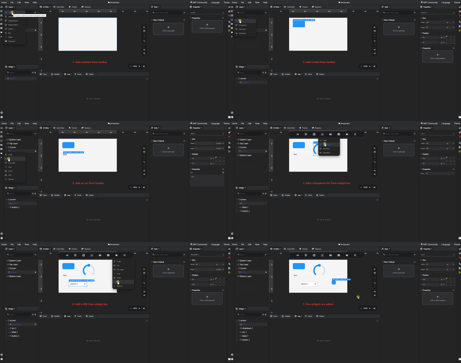
Advanced widgets offer additional configuration options that let you add child widgets and further customize their appearance and behavior. The following sections describe how to add and configure the Tile View, Tab View, Dropdown, List, Table, and Button Matrix widgets in detail.
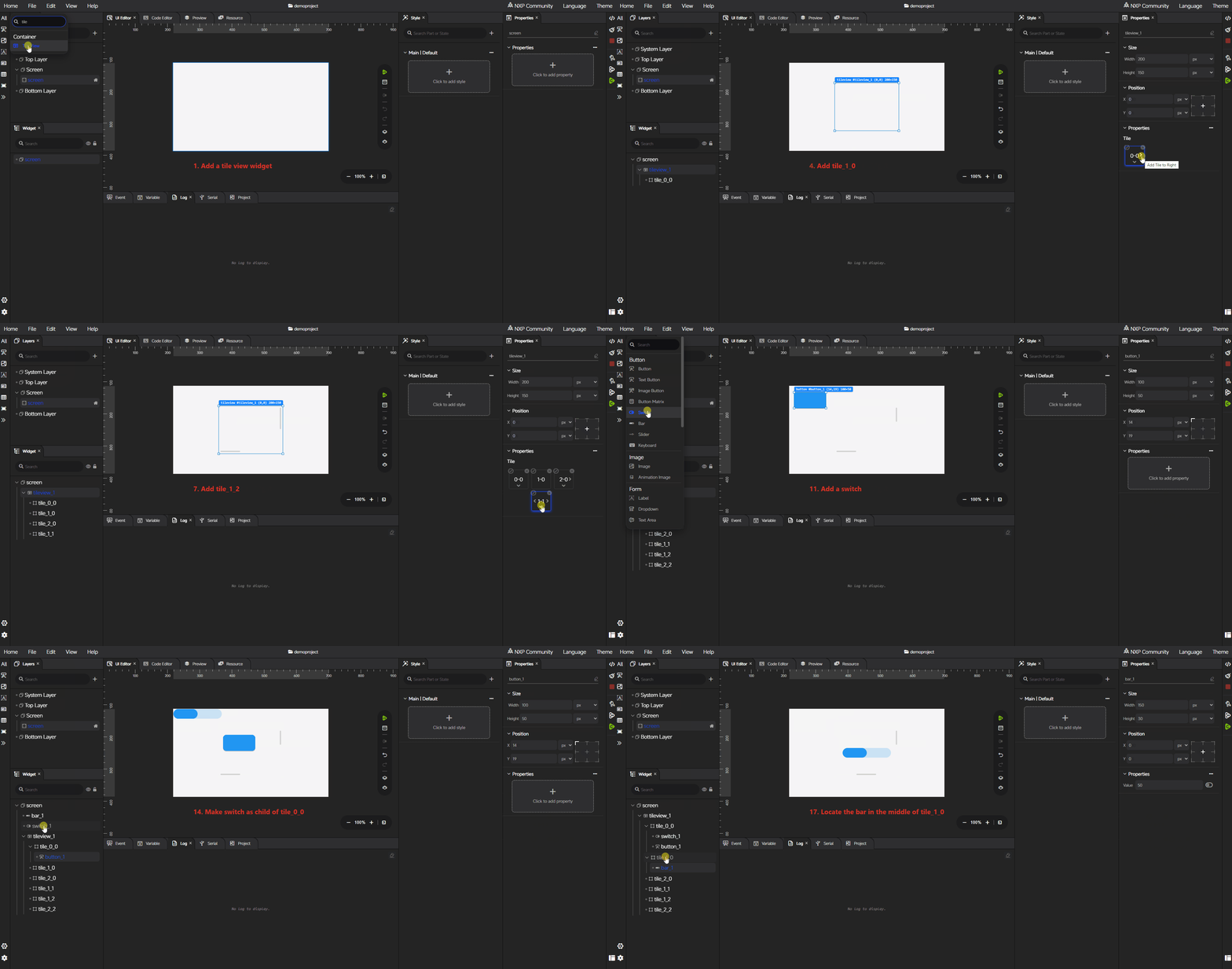
Tile View#
A Tile View organizes content into multiple tiles that users can navigate by swiping. The following animation demonstrates the Tile View configuration workflow, including how to add tiles, add child widgets to a tile, and arrange the position of child widgets within a tile.
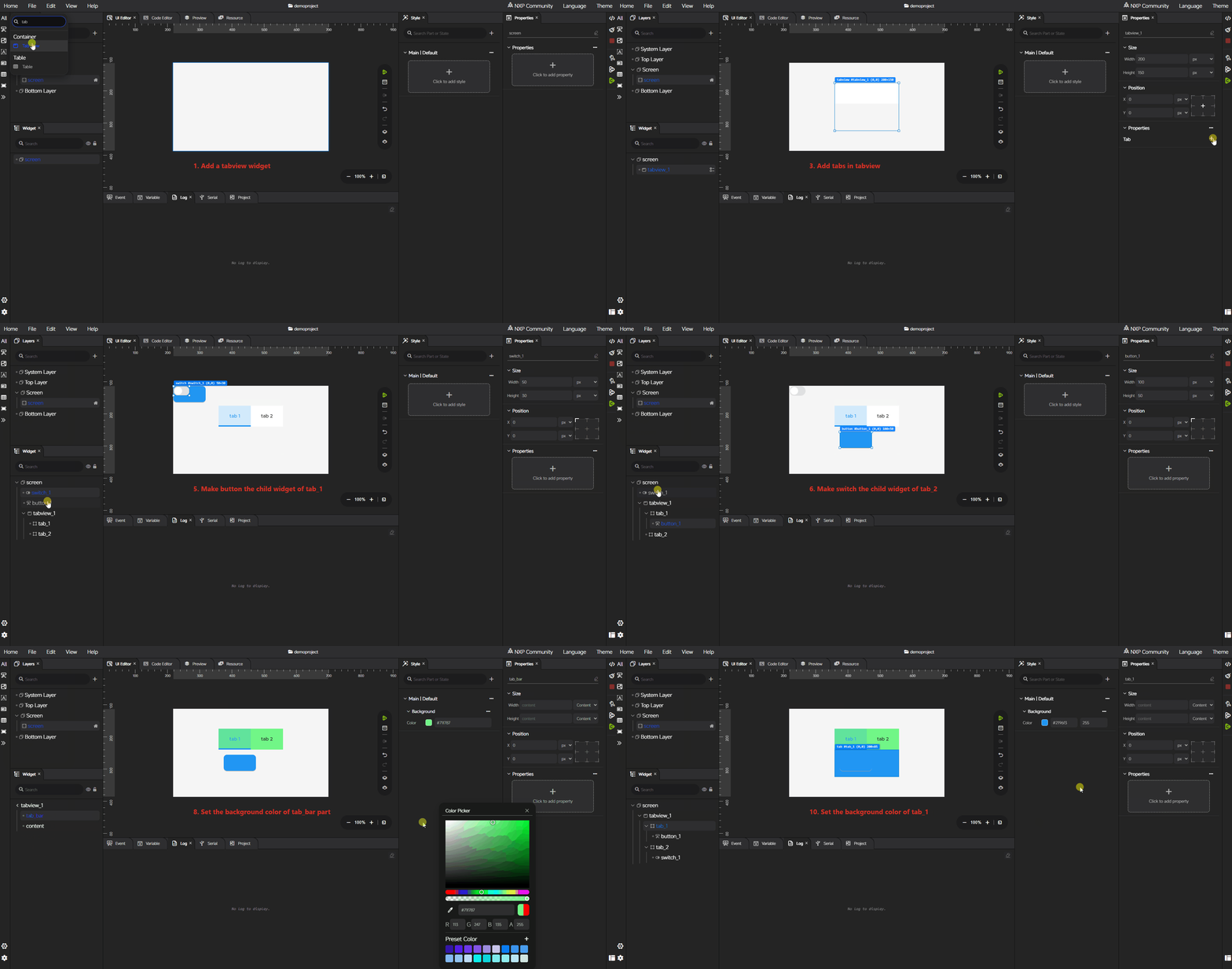
Tab View#
A Tab View groups content into separate tabs for clearer navigation. The following animation demonstrates the Tab View configuration workflow, including how to add tabs, add child widgets to a tab, and configure the styles of the individual parts of the Tab View.
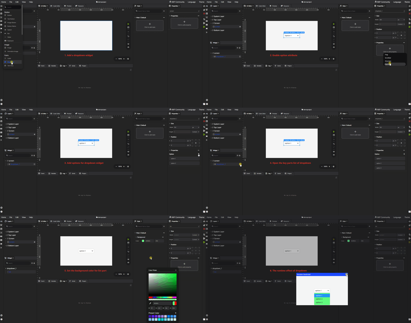
Dropdown#
A Dropdown presents a list of selectable options in a compact control. The following animation demonstrates the Dropdown configuration workflow, including how to add options and configure the styles of its key parts.
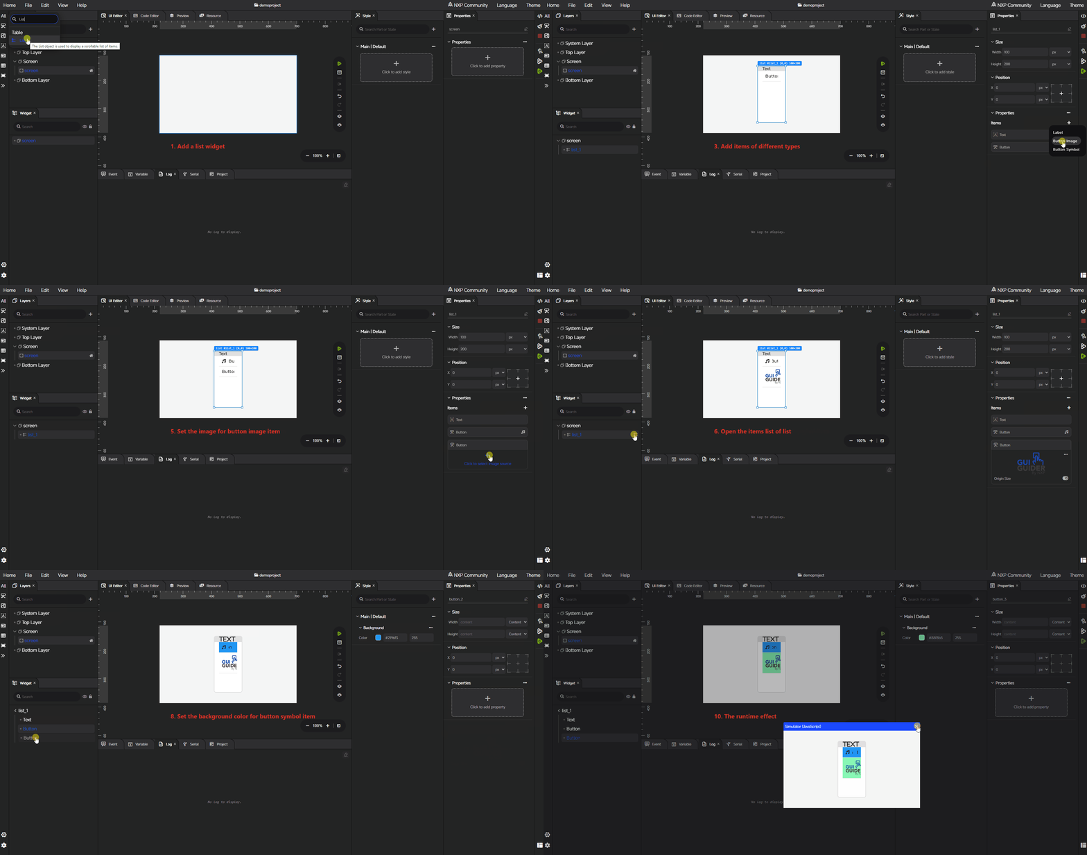
List#
A List displays a scrollable collection of items. The following animation demonstrates the List configuration workflow, including how to add items and configure the style of each item. Three types of list items are available: text item, image button, and button with symbol. You can customize the appearance of list items through the style configuration panel and define their behavior using the event settings.
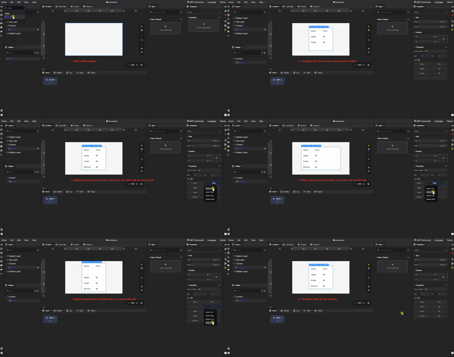
Table#
A Table displays data in rows and columns. The following animation demonstrates the Table configuration workflow, including how to configure the number of rows and columns and how to add or delete rows and columns.
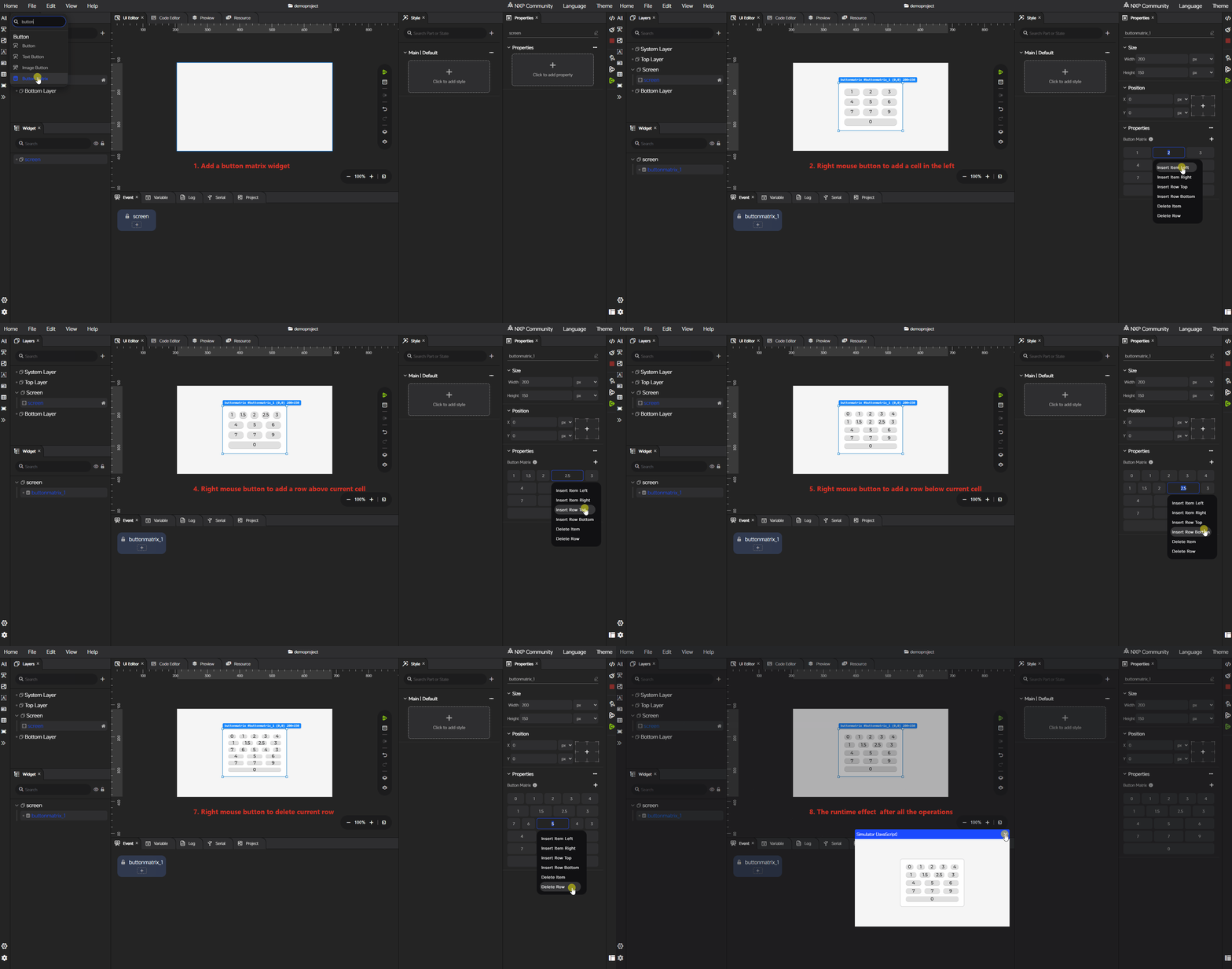
Button Matrix#
A Button Matrix arranges multiple buttons in a grid layout. The following animation demonstrates the Button Matrix configuration workflow, including how to add or delete rows and columns, how to add or delete items.
Layers#
The Layers area organizes the top-level screen structure of the workspace. It mirrors the LVGL display layer model and contains four entries, listed below from top to bottom in stacking order:
System layer (
lv_layer_sys): The topmost layer, reserved for system-level content rather than application UI. It is a permanent, transparent, full-display-size screen above the Top layer, and is non-scrollable and non-clickable by default. Typical use cases include system-level objects such as the mouse cursor.Top layer (
lv_layer_top): A permanent, transparent, full-display-size screen positioned above the active screen. It is non-scrollable and non-clickable by default, both of which can be overridden. It is intended for widgets that must always appear on top of every screen, such as pop-up windows or other overlay content. When made clickable, it absorbs all user input and behaves as a modal layer.Screen: The normal application screens managed in the project. The screen set as the active screen sits between the Bottom layer and the Top layer in the stacking order. This is the main working area for most UI design tasks, and the screen list can be expanded or collapsed in the tree view. The first screen in this list is the default screen, which serves as the entry point of the designed application. The default screen cannot be deleted.
Bottom layer (
lv_layer_bottom): A permanent, transparent, full-display-size screen positioned below the active screen. It is non-scrollable but clickable. It is visible only when the active screen’s background opacity is less than 255, and its visibility is independent of which screen is currently active. It is typically used for background-oriented content shared across screens.
A search box at the top of the area filters screen-related content. An Add Screen action creates a new screen directly from this area.
The Top layer, System layer, and Bottom layer are independent of the active screen and remain visible regardless of which screen is loaded. This separation simplifies the management of overlays, system-level objects, and shared background content, while keeping regular application screens isolated in the Screens entry. Unlike screens added under Screens, the three system-level layers are fixed entries and their names cannot be modified.
Widget tree#
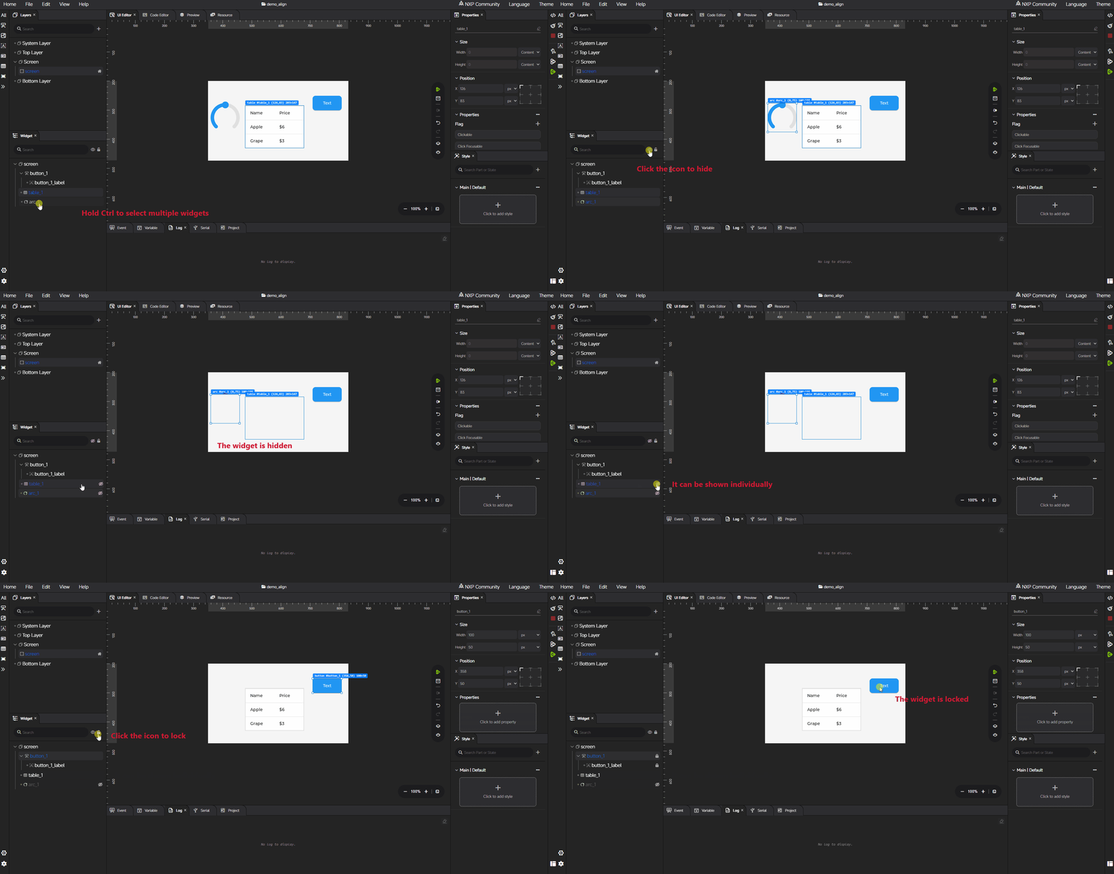
The Widget tree displays the structure of screens, layers, and widgets in a hierarchical view. It is useful when a screen contains many nested objects, or when precise structural editing is easier than direct selection on the canvas.
The Widget tree supports the following operations:
Search: Filter widgets by name through the search box at the top of the tree to quickly locate target objects.
Batch Show/Hide: Toggle the visibility of the currently selected widgets through the show/hide button in the tree toolbar.
Batch Lock/Unlock: Toggle the lock state of the currently selected widgets through the lock/unlock button in the tree toolbar.
Selection: Click a node to set the current widget. Use multi-selection or range selection to operate on several widgets at once. Selection stays synchronized with the workspace.
Expand and Collapse: Click the toggle icon on a parent node to expand or collapse its children.
Hierarchy Adjustment: Drag a widget node onto another node to reparent it, or drop it on a sibling drop line to reorder it within the same parent.
Rename: Double-click a widget name to edit it inline. The new name must follow the project naming rules. System-level layer entries cannot be renamed.
Inner List Access: For widgets that contain inner parts or items (such as Tab View or Tile View), click the inner-object icon on the node to open the inner widget list.
Context Menu: Right-click a widget node to open the context menu, which provides the following actions:
To Top: Move the selected widget to the top of the current hierarchy.
To Bottom: Move the selected widget to the bottom of the current hierarchy.
Delete: Delete the selected widget.
Select All: Select all widgets on the current screen.
Copy: Copy the selected widget.
Paste: Paste the previously copied widget.
Lock: Lock or unlock the selected widgets. Locked widgets cannot be moved or have their properties and styles modified until they are unlocked.
Hidden: Hide or show the selected widgets.
The Widget tree centralizes structure-oriented editing in one place, covering hierarchy, ordering, visibility, locking, and object actions.
UI editor#
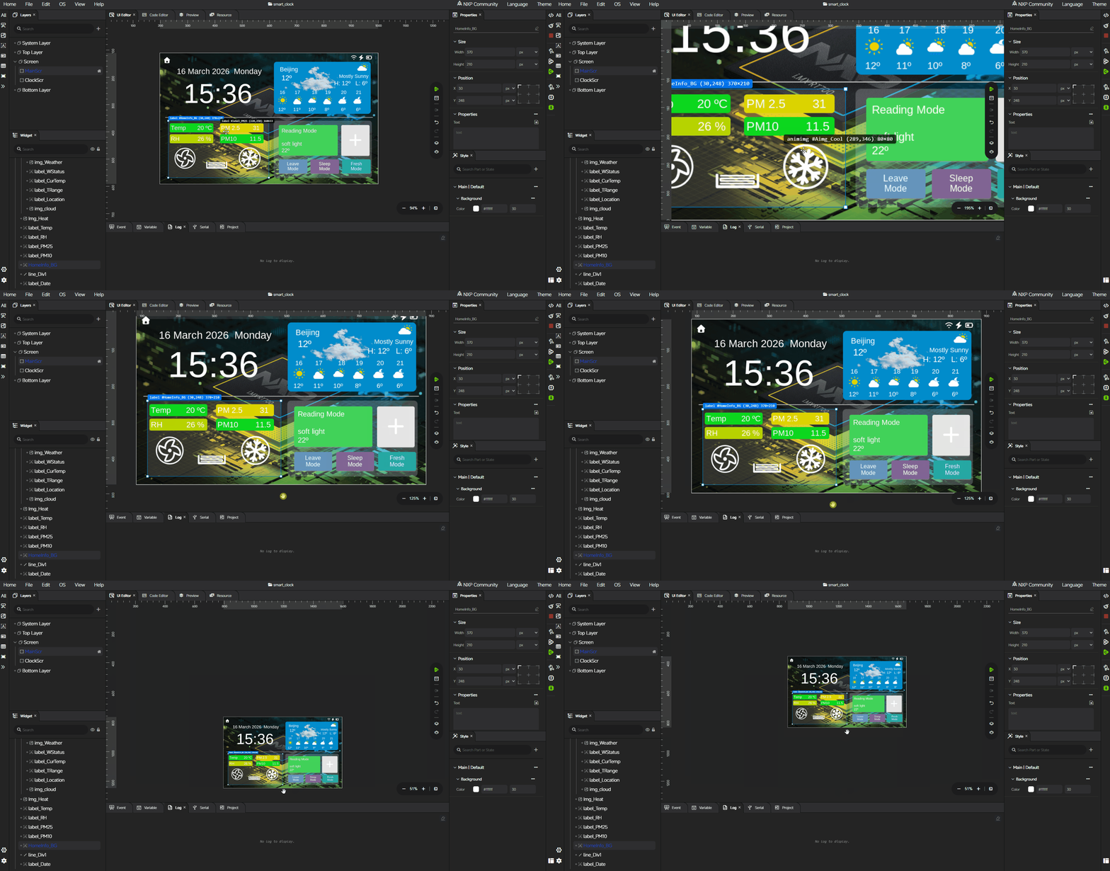
The UI editor is the main visual editing canvas. It is where screens and widgets are placed, arranged, and modified.
Key behaviors of the UI editor:
Alignment guides: Guide lines appear while a widget is being moved, helping align it with nearby widgets and produce a cleaner layout.
Multi-selection: Several widgets can be selected together and adjusted as a group for position and size, which speeds up layout refinement.
Context menu: Right-click a widget on the canvas to open the same context menu as in the Widget tree, providing actions such as To Top, To Bottom, Delete, Select All, Copy, Paste, Lock, and Hidden.
Canvas pan: Hold the Space key and drag to pan the canvas.
Canvas zoom: Hold Ctrl and scroll the mouse wheel to zoom the canvas in or out.
Code editor#
The Code editor shows the project folder structure and lets you browse and edit project files without leaving GUI Guider. Any file in the project can be opened and modified directly; no additional editing restrictions are applied in this area.
Note: Files inside the
generatedfolder are overwritten on the next code generation. Files outside thegeneratedfolder are not affected by regeneration. Place hand-written changes that must be preserved outside thegeneratedfolder.
Resource manager#
The Resource manager manages project resources in GUI Guider. Two resource types are supported: image and font.
When importing resources, the file name of each resource is used to generate the corresponding variable name in the generated C code. Imported file names must therefore follow C variable naming rules, which keeps the generated code readable and preserves a clear mapping between the original file and the generated symbol.
A default built-in font is provided with the IDE. It is shared across all projects and cannot be deleted.
Preview center#
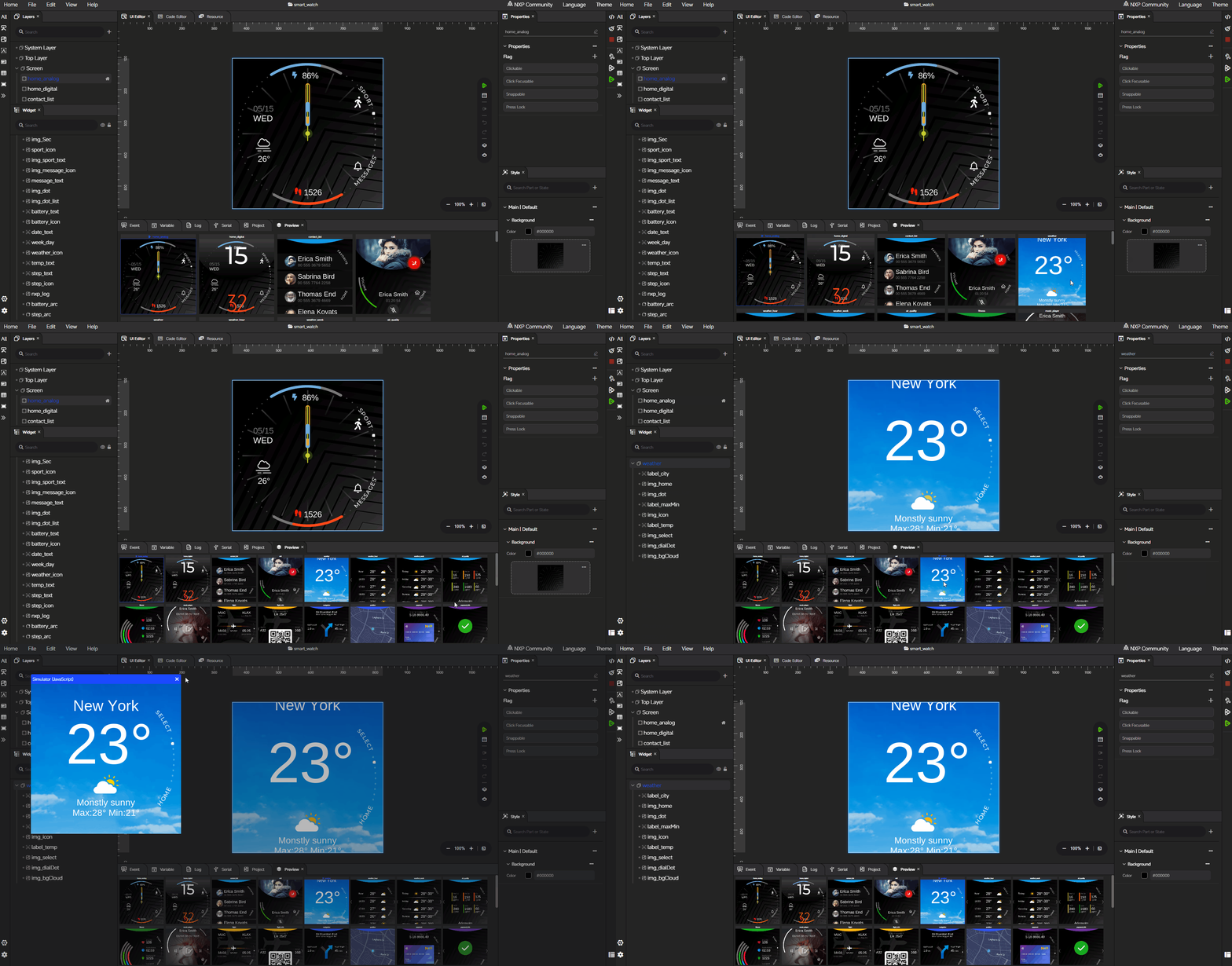
The Preview center reviews the screens of the current project directly inside the IDE. It lists all screens in the project and lets you switch between them quickly to check the visual result before running the simulator or validating on target.
Hold Ctrl and scroll the mouse wheel to scale the preview size.
Events#
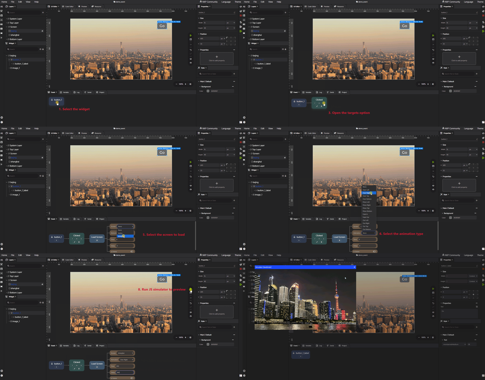
The Events area configures interaction logic for widgets and screens. An event is defined by selecting a source widget, choosing a trigger, and then attaching one or more target actions to that trigger.
Triggers#
The available trigger events are:
Input events: Clicked, Released, Pressed, Pressing, Press Lost, Short Clicked, Long Pressed, Long Pressed Repeat
Focus events: Focused, Defocused, Leave
Gesture events: Gesture Left, Gesture Right, Gesture Top, Gesture Bottom
Value and state events: Value Changed, Size Changed, Style Changed, Layout Changed, Color Format Changed, Hit Test
Screen lifecycle events: Screen Load Start, Screen Loaded, Screen Unload Start, Screen Unloaded
General lifecycle events: Create, Delete, Ready, Cancel, Refresh, Insert
Targets#
Each trigger can drive one of three target types:
Custom Code: Runs a user-provided code snippet, with optional include headers and inline C code.
Load Screen: Switches to another screen. Configurable options include the destination screen, the load animation, animation Time, Delay, and whether the previous screen should be deleted. The supported load animations are
LV_SCREEN_LOAD_ANIM_NONE,LV_SCREEN_LOAD_ANIM_OVER_LEFT,LV_SCREEN_LOAD_ANIM_OVER_RIGHT,LV_SCREEN_LOAD_ANIM_OVER_TOP,LV_SCREEN_LOAD_ANIM_OVER_BOTTOM,LV_SCREEN_LOAD_ANIM_MOVE_LEFT,LV_SCREEN_LOAD_ANIM_MOVE_RIGHT,LV_SCREEN_LOAD_ANIM_MOVE_TOP,LV_SCREEN_LOAD_ANIM_MOVE_BOTTOM,LV_SCREEN_LOAD_ANIM_FADE_IN,LV_SCREEN_LOAD_ANIM_FADE_OUT,LV_SCREEN_LOAD_ANIM_OUT_LEFT,LV_SCREEN_LOAD_ANIM_OUT_RIGHT,LV_SCREEN_LOAD_ANIM_OUT_TOP, andLV_SCREEN_LOAD_ANIM_OUT_BOTTOM.Widget: Updates a property or state of another widget. Common widget actions include:
Style: Applies a style change to the target widget. Style updates can be applied to different widget parts; for part-specific behavior, refer to the corresponding LVGL parts and states documentation.
X, Y, Width, Height: Updates the target widget’s position or size.
Add State, Remove State: Adds or removes LVGL states such as
LV_STATE_CHECKED,LV_STATE_FOCUSED,LV_STATE_PRESSED, orLV_STATE_DISABLED.Add Flag, Remove Flag: Adds or removes LVGL object flags on the target widget.
Widget-specific actions: When the target widget supports them, additional properties such as Text (Label, Text Area, Checkbox), Value (Bar, Slider, Spinbox, Arc), Active Tab (Tab View), Scale / Rotation (Image, Arc), Brightness (LED), Chart Type (Chart), or Arc Angle (Spinner) are available.
Animations on targets#
In addition to direct target updates, an event can drive an animation on a target widget. The supported animation actions are Start, Pause, Resume, and Stop, which operate on an animation variable defined in the Global variables area.
What you can build with events#
This workflow builds simple UI interactions directly in the IDE. You can change widget appearance, update geometry, switch screens, drive animations, or call custom logic when an event is triggered.
Global variables#
The Global variables area is used to manage project-level variables and related logic objects that can be shared across the current project.
In addition to general variable usage, the current workflow also supports related logic configuration, including conditions and animations. These items are used together with events and project logic when dynamic behavior is required.
Condition#
A Condition variable defines reusable conditional logic that can be referenced from events. Two condition types are supported:
IF: Each branch is entered as a C-style clause. For example:
if (a == b)
else if (a > b)
else
Switch: Configure the switch expression first, and then add one entry per case. For example:
switch a
case 0
case 1
default
Both types are written in a C-style expression format. Every variable referenced in the expression must be defined in the project beforehand. Otherwise, the condition cannot be applied correctly.
Note: The JS simulator runs a pre-compiled JS binding WASM build, so events that depend on a Condition variable do not take effect in the JS simulator. This is a known limitation. To validate condition-based logic, run the simulator build or deploy to target.
Animation#
An Animation variable defines a reusable animation configuration that can be referenced from events. Each animation configuration includes:
An animation name.
The LVGL animation-related configuration (such as duration, delay, repeat, and path).
A Default Action that determines which properties the animation drives on the target widget.
The Default Action in an animation reuses the same property set as the Default Action configured on a widget target in the Events workflow. The difference is that an event default action is filtered by the selected target widget type and exposes widget-specific actions accordingly, while an animation default action is defined independently of any target widget and therefore does not include widget-specific actions. Widget-specific actions become available only when the animation is bound to a target widget in an event.
For each selected default action, the corresponding start value and end value must be configured so that the animation can run with the expected effect.
When an Animation variable is used in an event, the relationship is inheritance-based. The animation configured in the event inherits the configuration defined in the Animation variable, including its default actions. If new actions are added in the event, those actions override the corresponding default actions inherited from the animation variable, while the other inherited actions remain in effect.
Using condition and animation in events#
Condition and Animation variables are consumed directly in the event workflow:
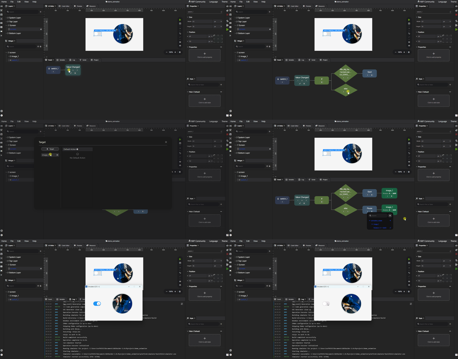
Click If in the event editor to attach an existing Condition variable to the event.
Click An in the event editor to attach an existing Animation variable to the event.
If the required variable does not exist yet, create it in the Global variables area first and then reference it in the event.
The following example shows the complete flow for adding animation and condition logic in an event. It uses a switch state to control image rotation and pause the animation.
Log#
The Log area displays workflow messages for the current project, such as operation output and build progress. Each entry shows the timestamp, the level (INFO, SUCCESS, WARNING, or ERROR), and the message. Click the clear button in the top-right corner to remove all entries from the current view.
Serial port#
The Serial port area is used for serial-port-based communication inside the GUI Guider workspace.
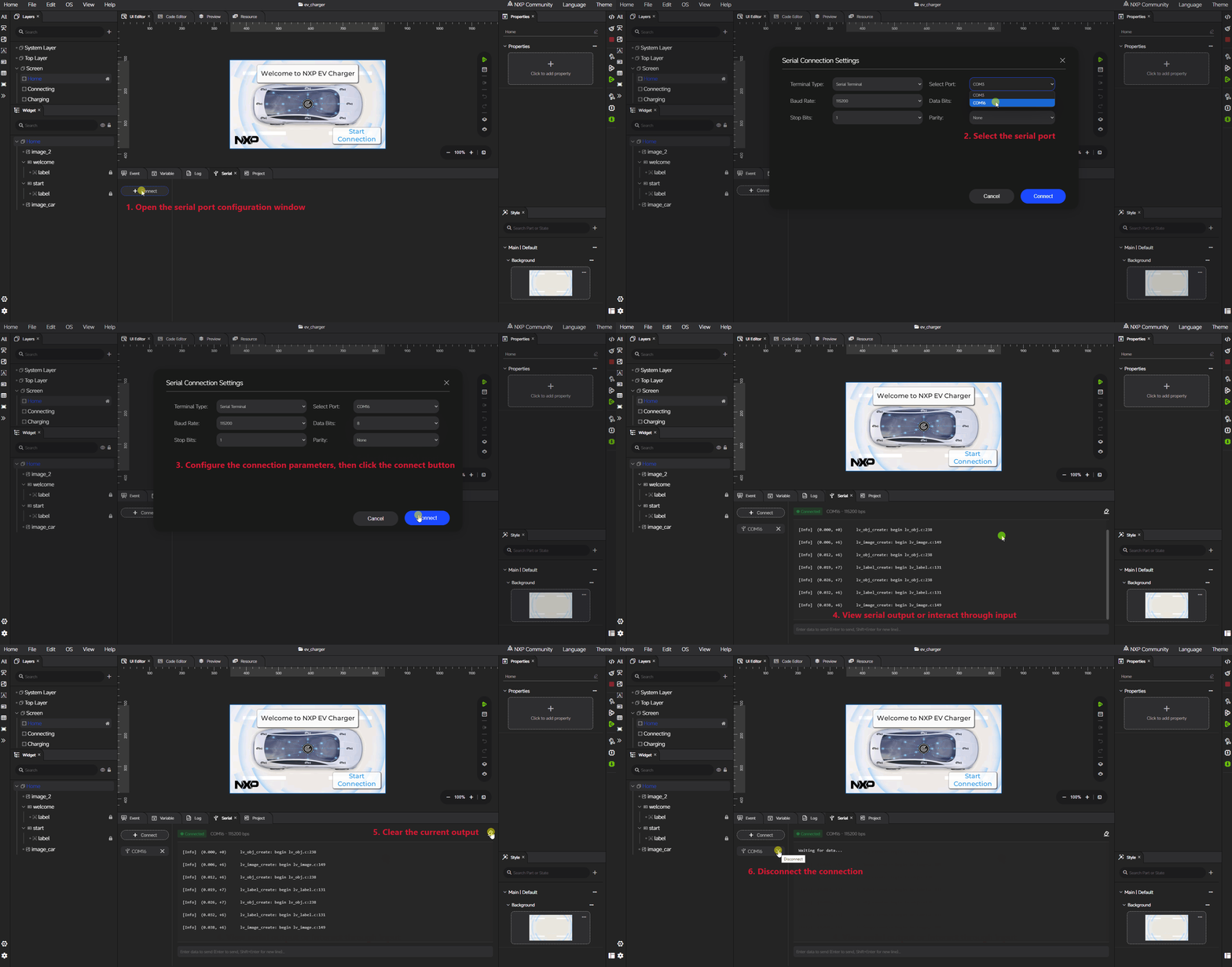
It provides a workflow for selecting a serial port, configuring the connection, opening or closing the serial link, and exchanging data with the connected target or device.
Typical serial-related functions include:
Selecting the available serial port.
Configuring the baud rate and other connection settings.
Connecting to or disconnecting from the selected serial device.
Sending data from the IDE side.
Viewing received data in the serial area.
Clearing or refreshing serial-related content when required.
This area is used when the current project or target workflow requires serial communication for testing, interaction, or runtime observation.
Note: If the project is an LVGL application, make sure the log option is enabled in the LVGL setting.
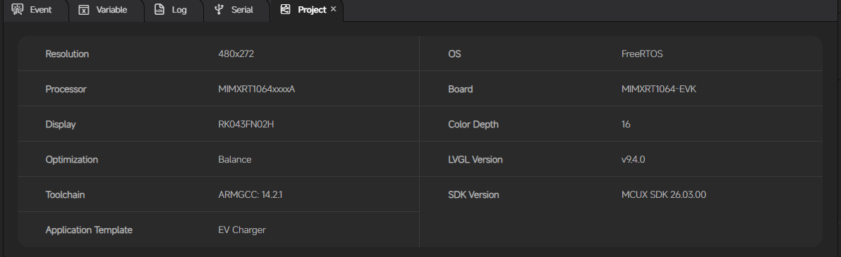
Project info#
The Project info area displays the current project and its related content inside the workspace. It provides a project-oriented view, so that you can understand what belongs to the active project without leaving the IDE.
Typical information shown in this area includes the active project context, project-related content organization, and the structure associated with the current project folder. This makes it easier to confirm that the correct project is open before continuing with editing, generation, or validation.
Properties#
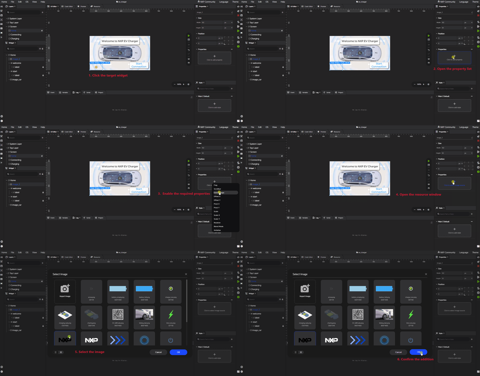
The Properties panel is used to configure the currently selected screen or widget.
The available property items vary depending on the selected object type. Property definitions are designed to match the corresponding LVGL widget configurations as closely as possible. This alignment ensures that properties in GUI Guider are consistent with the features supported by LVGL.
For different widget types, the Properties panel exposes object-specific settings such as basic attributes, flags, image-related settings, text-related settings, geometry-related values, and widget-specific functional options.
Styles#
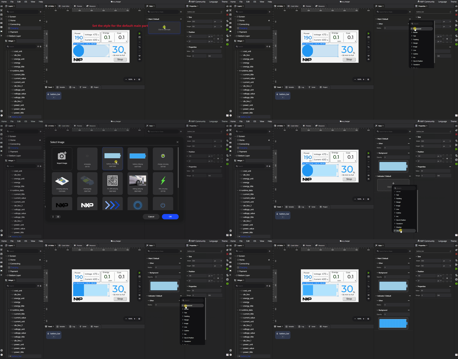
The Styles area manages the visual appearance of the selected widget or screen. The style items, parts, and states exposed in the IDE are fully aligned with the LVGL widget style model, so each entry maps one-to-one to the corresponding LVGL style property.
Parts and states#
Each style is scoped by the widget part it applies to and the state in which it is active. The available parts and states depend on the selected widget — only the parts and states that the widget actually supports are exposed in the IDE.
The full set of parts is: LV_PART_MAIN, LV_PART_SCROLLBAR, LV_PART_INDICATOR, LV_PART_KNOB, LV_PART_SELECTED, LV_PART_ITEMS, LV_PART_CURSOR, LV_PART_CUSTOM_FIRST, LV_PART_ANY.
The full set of states is: LV_STATE_DEFAULT, LV_STATE_CHECKED, LV_STATE_FOCUSED, LV_STATE_FOCUS_KEY, LV_STATE_EDITED, LV_STATE_HOVERED, LV_STATE_PRESSED, LV_STATE_SCROLLED, LV_STATE_DISABLED, LV_STATE_ANY.
Style groups#
The style items are organized into the following groups:
Background:
bg_color,bg_opa,bg_grad_color,bg_grad_dir,bg_main_stop,bg_grad_stop,bg_main_opa,bg_grad_opa,bg_image_src,bg_image_opa,bg_image_recolor,bg_image_recolor_opa,bg_image_tiled.Border:
border_color,border_opa,border_width,border_side,border_post.Text:
text_color,text_opa,text_size,text_family,text_letter_space,text_line_space,text_decor,text_align,text_outline_stroke_color,text_outline_stroke_width,text_outline_stroke_opa.Padding:
pad_top,pad_bottom,pad_left,pad_right,pad_row,pad_column,pad_radial.Margin:
margin_top,margin_bottom,margin_left,margin_right.Image:
image_opa,image_recolor,image_recolor_opa.Line:
line_color,line_opa,line_width,line_rounded,line_dash_width,line_dash_gap.Outline:
outline_color,outline_opa,outline_width,outline_pad.Arc:
arc_color,arc_opa,arc_width,arc_rounded,arc_image_src.Size / Position:
min_width,max_width,min_height,max_height,length.Transform:
translate_radial,transform_rotation,transform_width,transform_height,translate_x,translate_y,transform_scale_x,transform_scale_y,transform_pivot_x,transform_pivot_y,transform_skew_x,transform_skew_y.Shadow:
shadow_color,shadow_opa,shadow_offset_x,shadow_offset_y,shadow_width,shadow_spread.Other:
recolor,recolor_opa,opa,radius,clip_corner,radial_offset,opa_layered,anim_duration,blend_mode,base_dir,rotary_sensitivity.
Because the style configuration in the IDE is fully aligned with LVGL — using the same property names, value sets, and parts/states — any change made in the Styles area produces the same visual behavior as setting the corresponding LVGL style directly on the widget. For detailed semantics of any style property, refer to the matching section in the LVGL documentation.
Shortcut keys#
GUI Guider supports the following shortcut keys. Actual key bindings may differ slightly across operating systems and desktop environments, but each shortcut performs the same action regardless of platform.
Ctrl+O — Import: Open or import a GUI Guider project from disk.
Ctrl+S — Save: Save all changes of the current project.
Ctrl+Z — Undo: Undo the last change to the current project (UI and events).
Ctrl+Y — Redo: Redo the last undone change to the current project (UI and events).
Ctrl+A — Select All: Select all widgets on the current screen.
Ctrl+C — Copy: Copy the selected widgets from the UI editor, screen tree, or widget tree.
Ctrl+V — Paste: Paste the copied widgets.
Delete — Delete: Delete the selected widgets or screens.
Ctrl+Shift+H — Hide: Show or hide the selected widgets (toggle visibility).
Ctrl+Shift+L — Lock: Lock or unlock the selected widgets (toggle).
Ctrl+Shift+] — To Top: Bring the selected widget or screen to the front (top layer).
Ctrl+Shift+[ — To Bottom: Send the selected widget or screen to the back (bottom layer).
Ctrl+E — JSON Editor: Open the JSON editor of the selected screen or widget.
Ctrl+J — JS Simulator: Open the JavaScript simulator for immediate simulation.
Ctrl+G — Generate Code: Generate source code for the current project.
Ctrl+Shift+Delete — Clean Build: Clean the generated build artifacts of the simulator.
Ctrl+B — Build Simulator: Build the simulator binary for the current project.
F5 — Run Simulator: Run the simulator for the loaded workspace project.
Ctrl+F5 — Simulator Pipeline: Generate, build, and run the simulator in one step (full pipeline).
Ctrl+Shift+B — Build Target: Build the target output for the loaded workspace project.
Ctrl+Shift+D — Deploy Target: Deploy the target output for the loaded workspace project.
Ctrl+Shift+F5 — Target Pipeline: Build and deploy the target in one step (full pipeline).
Escape — Close Modal: Close the active dialog window.
Space — Canvas Drag: Hold Space + left mouse button to pan the canvas in the UI editor.