Advanced usage#
This chapter introduces advanced GUI Guider workflows for users who want to move beyond basic screen editing and explore more structured, integration-focused development patterns. Advanced usage often involves coordinating visual design, generated code, external design assets, and project-specific customization.
Figma to GUI Guider#
Design handoff from Figma or similar design tools can accelerate UI development when a project already has visual design assets. In practice, treat these assets as implementation guidance rather than exact runtime guarantees, because embedded UI projects often require adaptation to fit target limitations, memory constraints, and rendering capabilities.
The Figma to GUI Guider plugin provides a structured way to convert a Figma design into a GUI Guider project: it maps Figma layers and components to LVGL widgets, exports the result as a project package, and lets you continue editing in GUI Guider. This section describes how to install the plugin, configure mappings, run the conversion, and import the result into GUI Guider.
Installing the plugin#
The Figma to GUI Guider plugin is published on the Figma Community, so you can install and run it directly from either the Figma desktop application or the browser version. You do not need to download the plugin package or load it manually.
Note: The Figma to GUI Guider plugin currently supports the Windows platform only.
To install the plugin, perform the following steps:
Open Figma: Launch the Figma desktop application or open Figma in your browser, and sign in with your Figma account.
Find the plugin: Open the Figma to GUI Guider plugin page directly, or search the Figma Community for Figma to GUI Guider.
Run the plugin: On the plugin page, click Open in… to run it directly, or save it to your account so that it is available for later use.
Launch from a design file: Open a design file, then start the plugin from the Plugins menu (or right-click and select Plugins).
Plugin UI walkthrough#
Once the plugin starts, its UI opens as a panel inside the Figma workspace.
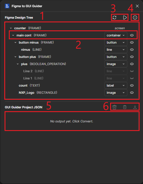
The plugin UI is divided into several key areas:
Figma design tree: At the top of the panel, the design node tree gives a clear overview of the Figma layer and component hierarchy. Each node can be configured with an LVGL widget mapping and a conversion status.
Design node: Each design node entry shows the node name and its Figma type. It provides an LVGL Type Selector to set the type mapping, and a Disable/Enable in Conversion button to control inclusion.
Tree action buttons: Next to the design tree are two main action buttons. Refresh reloads the current Figma file structure, and Convert converts the Figma design into a GUI Guider project based on the current mapping configuration.
About button: In the top-right corner, the About button can open about page shows plugin information, version, support contact and reference links.
GUI Guider project JSON: After conversion, the plugin shows the GUI Guider project JSON below the mapping area, where you can review the result and adjust the design tree mappings if any output does not match what you expect.
JSON action buttons: On the side of the output area are three action buttons: Clear removes the current result, Copy copies the JSON output, and Download exports the converted project file together with all images as a zip package.
Configure and convert#
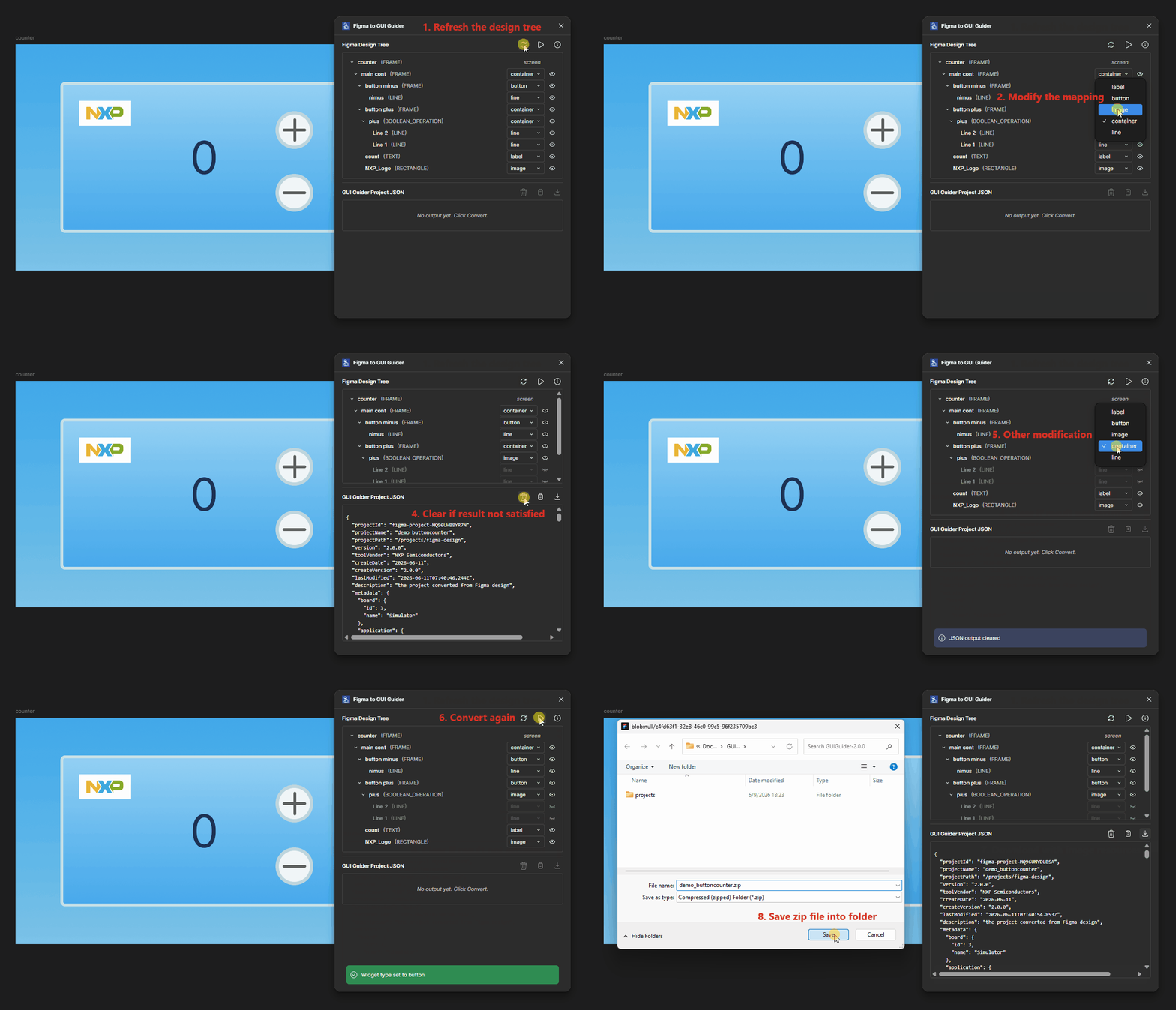
When you first open the plugin in a Figma design, it automatically generates an initial mapping from Figma nodes to GUI Guider widgets. The recommended workflow is to review this auto-mapping first, then adjust it as needed before running the conversion.
Review auto mapping: Walk through the design tree and check that each node has a reasonable LVGL widget type assigned.
Type mapping: Use the Type Selector on any node to change its mapping if the auto-selected type is not appropriate. The plugin saves mapping settings in your Figma project, which lets you refine the configuration over time without redoing it from scratch.
Disable configuration: Use the Disable in Conversion button to exclude a node from the generated output. A disabled node does not appear in the generated JSON, but its children remain in the hierarchy. When you map a node to an image, all of its children are automatically disabled.
Convert: When you finish the configuration, or whenever you want to check the current result, click Convert to run the conversion based on your settings.
Exporting the converted project#
After conversion, the plugin shows the resulting GUI Guider project JSON in the output area, which you can use to validate the conversion before exporting.
Review output: Use the JSON output area for a quick review of the converted structure. If something is incorrect, return to the design tree, adjust the mapping or disable state, and run Convert again.
Export as zip: When you are satisfied with the result, click Download to save the exported project, including all images, as a zip file on your local machine.
Importing the zip file into GUI Guider#
Import the exported zip file into GUI Guider as a project, where you can edit the design, run simulations, or deploy to target.
Open GUI Guider: Launch the GUI Guider application.
Unzip the exported file: Locate the exported zip file and unzip it to a working folder.
Copy font files: If your design uses custom fonts, copy the font files to the
resources/fontfolder in the unzipped project directory.Start import: On the GUI Guider IDE home page, navigate to Import Project and select the
.guiguiderfile in the unzipped folder.Complete import: After loading, the converted design is available for further editing in GUI Guider. From this point, you can use the JS simulator, the C simulator, or run the project on the target to validate the design.
Troubleshooting and tips#
Import errors in GUI Guider: If the import does not succeed, delete the previously imported design project and try the import again with a clean state.
Design tips: Align your Figma design structure with the LVGL widget hierarchy as much as possible. A design whose layer structure already reflects parent/child widget relationships tends to produce more accurate and more reliable conversion results.
JSON-based UI editing#
JSON-based editing supports structured workflows that help you create, transform, or review UI data outside the visual editor. This is especially useful when projects rely on automation, interchange formats, or reviewable UI structure definitions.
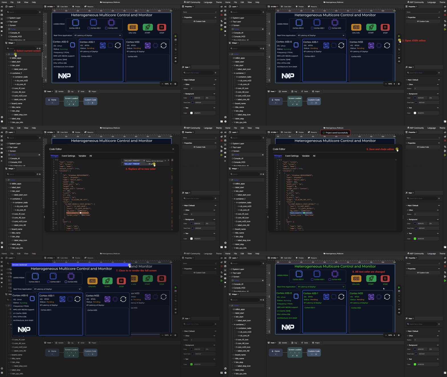
If you understand LVGL properties, JSON editing can improve development efficiency. GUI Guider lets you edit UI-related JSON files directly in a project, which speeds up style configuration compared to setting each property in the visual editor.
This workflow is effective for batch adjustments, such as:
Applying the same style to many widgets.
Tuning consistent color or spacing values across screens.
Making structural changes that would require many repetitive operations in the visual editor.
When using this approach, keep the following points in mind:
JSON structure validity: The project JSON must remain structurally valid. Missing fields, incorrect nesting, or broken references can prevent the project from loading correctly.
Widget property validity: Each property value must be valid for the corresponding LVGL widget type. Unsupported properties or out-of-range values may go undetected until rendering, and can lead to rendering errors or unexpected behavior.
Responsibility on the editor: Direct JSON editing bypasses validation checks, so the correctness of the result is the responsibility of the user. Back up the project, or edit it under version control, before making large manual changes.
Use the visual editor to create the initial UI structure, switch to JSON-based editing for fine-grained or repetitive adjustments, then return to the visual editor or simulator to verify the result.
Custom code integration#
Many real projects require custom logic in addition to generated UI code. GUI Guider supports this through a controlled integration approach between the visual UI workflow and handwritten application code. When possible, keep custom logic separate from code that is expected to be regenerated.
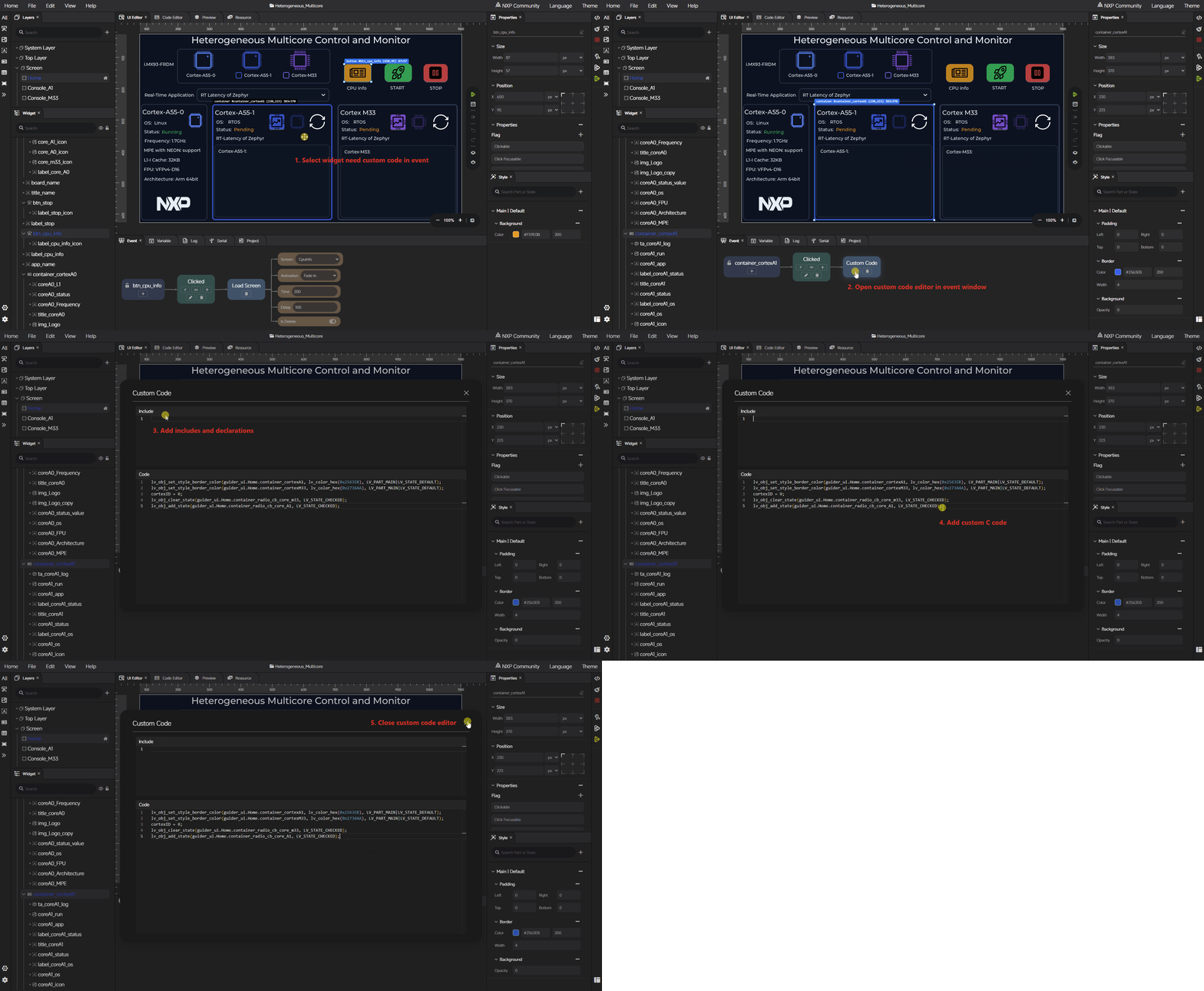
During application design, complex UI interaction scenarios often cannot be fully expressed through the standard visual UI configuration alone. In these cases, custom code becomes necessary, and GUI Guider provides a complete integration experience for combining hand-written logic with generated UI code.
There are two main places where custom code can be added inside a GUI Guider project:
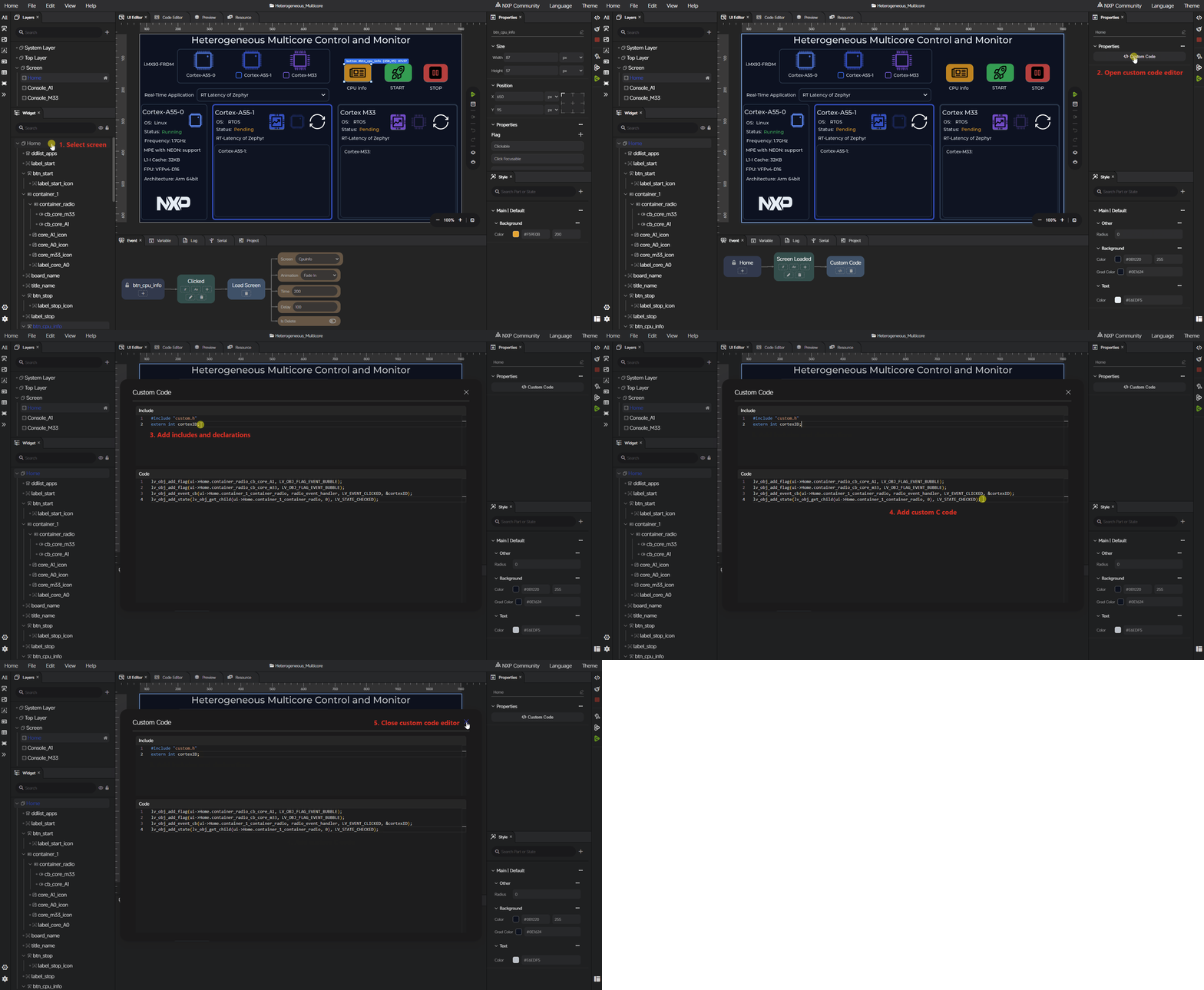
Custom code in a screen#
When a screen needs additional logic that runs together with its UI setup, you can add custom code directly within that screen. This is useful for scenarios such as initializing screen-specific state, preparing data sources before widgets are displayed, or performing per-screen actions that go beyond standard widget configuration.
Custom code added in the screen scope is preserved across code generation, so you can iterate on the visual design without losing your hand-written logic.
Custom code in an event#
When the logic is triggered by user interaction or by another event source, you can add custom code inside an event handler. This covers scenarios such as responding to button presses with non-standard behavior, coordinating multiple widgets for a single event, or calling application-level logic from the UI layer.
Adding custom code in events keeps interaction logic close to the source widget, which makes the event flow easier to follow in the generated code.